Why Is My Procreate Palette Dull? Tips to Enhance Your Colors – Meta Description
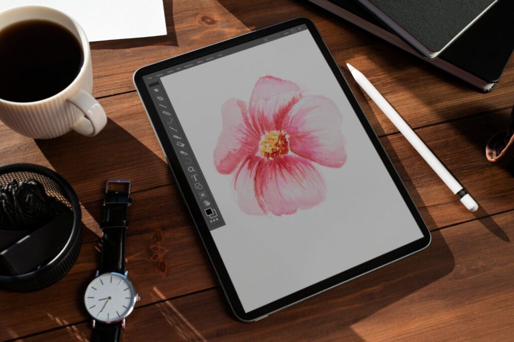
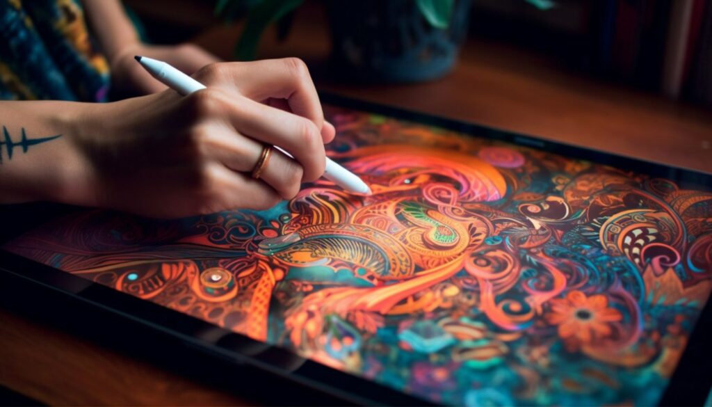
Many digital artists are left wondering, “Why is my procreate palette dull?” This is a common issue faced by Procreate users, but worry not! In this ultimate guide, we’ll discuss some helpful tips and tricks to help you achieve vibrant and beautiful colors in your digital artwork. We’ll walk you through some insightful YouTube tutorials, offer suggestions on how to avoid common pitfalls, and provide summaries of what each video offers. So, let’s dive in and unlock your color potential!
1. Understanding and Fixing Bad Colors in Procreate

In this comprehensive video by Ghost Paper, the narrator highlights various mistakes iPad users often make when working with Procreate. Additionally, this tutorial shares four valuable tips to assist you in improving your color palette. The narrator emphasizes the importance of minimizing your color palette, using colors to tell a story, following the 60/30/10 rule of color distribution, and experimenting with wild colors. This video is a great starting point for anyone seeking ways to enhance their Procreate color palette experience. Ghost Paper’s channel can be found here.
2. Procreate Greyscale Color Wheel Hack

Stayf Draws offers an interesting hack for those utilizing greyscale in Procreate in this tutorial. By accidentally saving 4K watercolor papers in greyscale, the artist discovered that importing a greyscale image into Procreate turned the color wheel into greyscale. This technique can come in handy when creating monochromatic artwork or when building a foundation for a more vibrant piece. Explore Stayf Draw’s engaging channel here.
3. Changing the Color Profile of an Existing Procreate File

In this helpful video, iPad Calligraphy shows you how to convert the color format of an existing document in Procreate, alter dimensions, and change resolution. The tutorial provides step-by-step instructions to guide you through these processes, making it easy to follow along. If you’ve ever wondered how to adjust color profiles or document settings in Procreate, this tutorial is a must-watch. Visit iPad Calligraphy’s informative channel here.
4. Brightening Dull CMYK Files in Procreate

Another excellent video from iPad Calligraphy, demonstrating how to increase the vibrancy of your artwork within Procreate when using the CMYK profile. By following these simple steps, you’ll be able to enhance the luminosity of your artwork without sacrificing quality. The tutorial includes a useful explanation on how to convert RGB to CMYK in Procreate, ensuring you retain accurate color conversion and profiles. Take a look at iPad Calligraphy’s insightful channel here.
5. Creating Stunning Color Palettes with Procreate’s Minimal Color Hack

Ghost Paper’s video showcases an easy-to-follow tutorial on utilizing Procreate’s minimal color hack technique. The video provides valuable insight into creating vibrant and harmonious color palettes, elevating your digital artwork to new heights. This technique is an excellent choice for artists looking to develop a more refined color scheme in their work. For more Procreate tips and tricks, follow Ghost Paper’s channel here.
Common Mistakes and How to Avoid Them
When working in Procreate, some common mistakes include using too many colors, not strategically utilizing the values of greyscale, not considering colorharmony, neglecting color profiles, and not adapting to Procreate’s unique features. To avoid these pitfalls, consider the following tips:
- Use a limited color palette and focus on complementing colors
- Employ greyscale wisely for better value contrast in your artwork
- Study color harmony and implement its principles in your work
- Understand the differences between color profiles (RGB and CMYK) and use them appropriately
- Stay updated on Procreate’s latest features and utilize available hacks
Conclusion
Creating vibrant and balanced colors in your Procreate artwork doesn’t have to be a struggle. By utilizing the tips and techniques shown in these videos, as well as understanding common mistakes and how to avoid them, you can overcome a dull palette and create stunning digital art. Remember to explore a variety of sources for inspiration, practice regularly, and immerse yourself in learning the ins and outs of the Procreate app. You’ll soon discover that harnessing the power of color in your artwork opens up a world of creative possibilities. Happy painting!