Which Color Profile for Procreate: A Comprehensive Comparison
Choosing the right color profile for your digital art is crucial for achieving the best results, especially when using a powerful app like Procreate. By understanding the available color profiles and their specific uses, you can make informed decisions and create stunning artwork. This article presents a comprehensive comparison of different color profiles for Procreate, helping you choose the best one for your project.
Understanding Color Profiles: Why They Matter
Color profiles, also known as color spaces or color models, define how colors are represented in various devices and applications. Picking the appropriate color profile ensures that your artwork displays consistently across different screens, and when printed, reproduces accurate colors. Let’s dive into the most popular color profiles for Procreate and their unique characteristics.
RGB vs. CMYK: The Core Color Models
Before delving into specific color profiles, it’s essential to understand the two primary color models: RGB and CMYK.
RGB – Red, Green, Blue
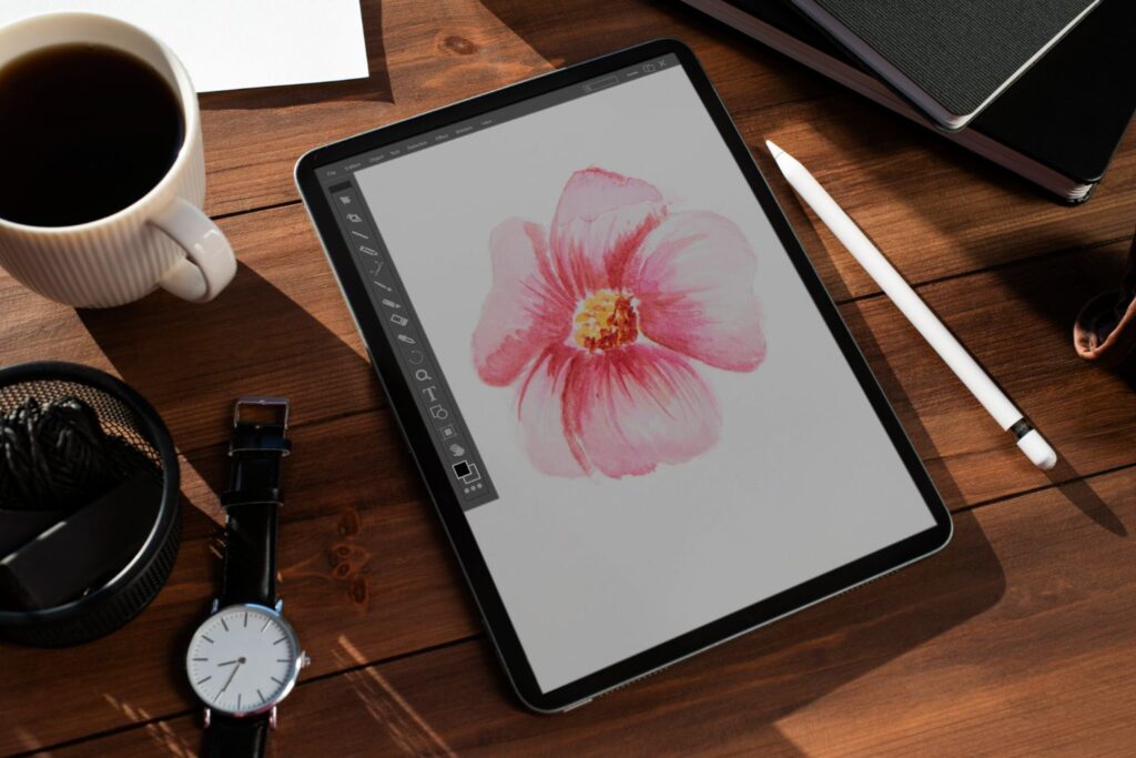
RGB is the standard color model for digital displays, including computer monitors, tablets, and smartphones. It uses the additive method, combining red, green, and blue light to create a wide range of colors. Procreate works natively in RGB since it’s designed for digital art.
CMYK – Cyan, Magenta, Yellow, Black
CMYK is the primary color model used for printing processes, employing a subtractive method. It combines cyan, magenta, yellow, and black ink to produce the desired colors. While CMYK is not the native color model for Procreate, you can export your artwork to this format when preparing it for printing.
A Look at Procreate Color Profiles
Procreate offers a selection of color profiles based on the RGB model. Each profile caters to different needs and desired results. Let’s review each option and its relevance for your creative process.
Display P3
Display P3 is a relatively new color profile that offers a wider color gamut than the traditional sRGB. It uses the same RGB primaries as the DCI-P3 digital cinema color space, but with a D65 white point, which is standard for computer monitors. This profile works exceptionally well for iPad Pro devices, ensuring vibrant colors and an extended color palette for digital art and illustration.
sRGB
sRGB is the most widely used color profile and is considered the standard for digital displays and online content. It provides a reasonably wide color gamut and consistent results across different devices, making it an excellent choice for digital artists who share their work on the internet. It is also supported by most web browsers and image editors, ensuring that yourartwork displays accurately on various platforms.
Adobe RGB
Adobe RGB is a color profile developed by Adobe in 1998 to meet the demands of professional photographers and designers. It has a wider color gamut than sRGB, covering a broader range of colors found in nature. This profile is suitable for artists working on high-quality prints, but it’s essential to ensure the final output device supports the Adobe RGB color space to prevent potential color discrepancies.
ProPhoto RGB
ProPhoto RGB is an even larger color profile, designed to encompass almost all visible colors. This profile is ideal for professionals working with RAW photographs, high-quality prints, and HDR images. It can be a beneficial choice for artists who want the most extensive range of colors. However, be aware that not all devices can display the ProPhoto RGB color gamut, so accurate color representation isn’t guaranteed across all screens.
Selecting the Right Color Profile for Your Procreate Project
Now that we’ve covered the various color profiles, it’s essential to consider your specific needs and choose the most suitable profile for your artwork. Here are some factors to help you make the best decision:
Device Compatibility
Consider the devices your artwork will primarily be displayed on. For example, if you create art for web content, sRGB might be your best bet. However, if you’re an iPad Pro user aiming to harness the full potential of your device, Display P3 is an excellent choice.
Color Vibrancy and Gamut
If you want the widest range of colors for your digital art, choose profiles with more extensive color gamuts, like Adobe RGB or ProPhoto RGB. Keep in mind that not all devices can display these extended color ranges, so make sure to check your target output device’s capabilities.
Printing Requirements
If your primary purpose is to create high-quality prints, consider profiles such as Adobe RGB that are more geared towards print production. Remember that Procreate works natively in the RGB color space, so you’ll need to export your artwork to CMYK before printing.
Conclusion
In conclusion, selecting the right color profile for your Procreate project is an essential step in producing impressive digital artwork. Consider factors such as device compatibility, color vibrancy, and your printing requirements when choosing a color profile. No matter your artistic focus, ensuring that your colors are accurate and consistent is key to bringing your vision to life.
FAQs
- Does Procreate work in CMYK?
- Can I change the color profile of an existing Procreate project?
- How do I know if my device supports a specific color profile?
- Which color profile should I use for social media?
- Can I use Adobe RGB or ProPhoto RGB for web content?
Procreate works natively in RGB, but you can export your artwork to CMYK if you need to prepare it for print.
Yes, youcan change the color profile of an existing Procreate project by going to Actions > Canvas > Color Profile and selecting the desired profile from the list. However, changing the color profile can cause color shifts in your artwork, so it’s best to choose the appropriate profile at the beginning of your project.
Check your device’s technical specifications or user manual for information about supported color profiles. For instance, iPad Pro devices support Display P3, offering a more extensive color gamut than standard displays.
sRGB is the best color profile for social media and web content, as it provides consistent results across various devices and is supported by most web browsers.
While you can technically use Adobe RGB or ProPhoto RGB for web content, it’s not recommended because many devices and web browsers don’t fully support these color profiles. Sticking to sRGB ensures accurate color representation for the majority of web users, making it the ideal choice for online content.